A Venn diagram is a graphical representation of the relationships between sets. It was invented by John Venn, an English mathematician, in the late 19th century.
A Venn diagram consists of one or more circles, each representing a set. The sets are typically represented by overlapping circles, with the area of overlap representing the elements that belong to both sets.
For example, let's say we have two sets: A = {1, 2, 3} and B = {3, 4, 5}. We can represent these sets using a Venn diagram as follows:
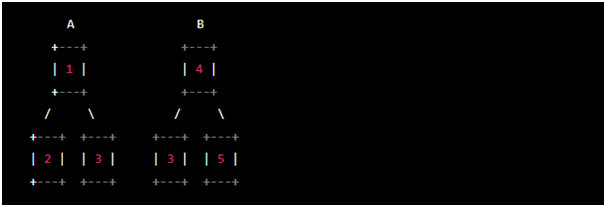
In this diagram, the circle on the left represents set A, and the circle on the right represents set B. The overlapping area represents the elements that belong to both sets (in this case, just the element 3).
Venn diagrams are often used in mathematics, logic, and statistics to illustrate relationships between sets and to solve problems involving set operations such as union, intersection, and complement. They are also used in many other fields, including computer science, business, and biology.
Venn diagrams can be a useful tool to visually illustrate relationships and connections between different sets of data.
Here are some ways Venn diagrams can be used in PowerPoint presentations:
1. Compare and Contrast: Use Venn diagrams to compare and contrast different ideas, concepts, or objects. For example, you can use a Venn diagram to compare and contrast two products, two companies, or two ideas.
2. Overlapping Elements: Use Venn diagrams to show the overlapping elements between two or more sets. This can be useful when you want to demonstrate how different sets of data or ideas are connected.
3. Categorization: Use Venn diagrams to categorize different items or ideas into specific groups. For example, you can use a Venn diagram to categorize different types of animals based on their characteristics.
4. Problem-Solving: Use Venn diagrams to solve problems or answer questions that involve multiple sets of data. This can be useful in business, science, or any other field where complex data needs to be analyzed.
To create a Venn diagram in PowerPoint, you can use the SmartArt feature or draw the diagram using shapes and lines. There are also many pre-designed Venn diagram templates available online that you can download and use in your PowerPoint presentations.
Venn diagram template example - Grunge Venn Diagram for PowerPoint
A Grunge Venn Diagram for PowerPoint is a graphic illustration that represents the intersection or overlap of different sets of data or concepts using a grunge or distressed design style. It is a variation of a Venn diagram, which is a diagrammatic representation of logical relationships between sets or groups.
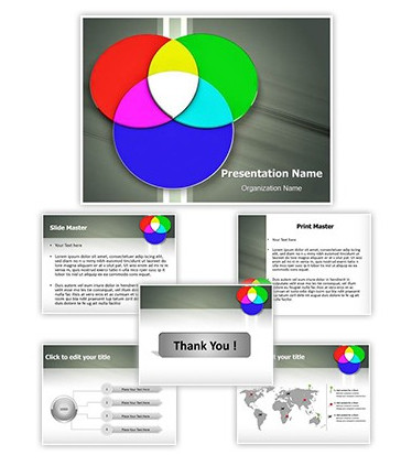
The Grunge Venn Diagram is an eye-catching and modern design that can be used in various contexts such as business presentations, academic lectures, or creative projects. It consists of circles that overlap in various ways to create different areas of intersection, which represent the relationships between the data or concepts being compared.
The Grunge Venn Diagram can be easily customized in PowerPoint to match the color scheme and style of your presentation. It can also be animated or enhanced with text, icons, or images to make it more engaging and impactful. Overall, the Grunge Venn Diagram is a versatile and effective visual tool that can help convey complex information or ideas in a simple and visually appealing way.
Venn Diagram PowerPoint presentations PowerPoint presentations Grunge Venn Diagram Venn Diagram template